
WHat A relief
 |  |  |  |  |  |
|---|---|---|---|---|---|
 |
This is my portfolio for our 'What a Relief' art unit. Here you will see pictures of some of my assessed artwork that I did throughout the course of the unit with some brief explanations of what and how I did it.

Details:
This piece of artwork was our first formative assessed piece of art work. We were supposed to use our skills on tonal study to create a piece of art work. The assessment was called "Egg on Paper - Tonal Study." The assessment required us to draw a picture of an egg placed on a crumpled piece of paper. The technique we used was to draw cross hairs on a transparent plastic sheet and trace enough detail and information onto it so that we can create a good and an almost equal size and shape of the actual paper and egg by tracing the detail from the plastic sheet onto a normal sheet of paper.
Final Product:
The picture shown above is my final piece. As you can see, it may not look completed but I think with more time I would have been able to make it look more complete and much better. One of the things that stand out for me is the egg. I used my skills of tone to make it look like a 3D object which added effect to the whole piece. I have shown due to where the lighting was coming from where the shadow would be and where the lightest part of the object should be. On the left hand side of the art work you can see that I had started to show and add detail to the folds of the paper and the shadow it was casting. With more time I would have been able to add more detail to the paper which would cause me to get a higher grade as I thought that the lack of work put into the right hand side caused me to get the grade I got.

Details:
This assessment was done a few weeks after the 'Egg on Paper' assessment an it is very similar to the technique we used for the Egg on Paper assessment. This also required our tonal skills to create the best drawing of a hand we have ever done hence the name of the assessment, "Best Drawing of a Hand Ever." It required us to pick any object that had meaning to us and draw our hand whilst holding the object. To make this easier we drew cross hairs on a clear plastic sheet (as shown in the picture below) and traced our hand to the best of our ability the same as what we did for our egg on paper assignment. I think that our Egg on Paper assignment was a practice for this one as we used tonal skills and cross hairs as a tracer.

Final Product:
For my final product, I chose a cigarette lighter as my object I will be holding in my hand. After many art classes I was finally able to complete my drawing of my hand and it is clearly the best drawing of a hand I have eve done. Although my thumb may be a bit wonky, I feel like my use of detail, size and tone give the drawing the effectiveness it was intentionally made to have. It shows which way the light is facing by using tone to create shadows and the detail i put into the drawing shows all the lines and marks in my hand. The things that i should improve on is the size of my thumb and the size of the cigarette lighter. My thumb looks abnormally large compared to my whole hand and the lighter looks smaller in the middle than it does at the sides.
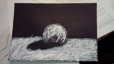
1st Picture
Details:
I think that these pieces of art work were mainly practices for my final art piece as we learnt how to use a lino cutter to carve out places we wanted light to show.
In the first picture it shows a painting of what my lino cut should look like. It was to give an idea of what it should look like as well depending on where the light was shining from and where the shadow was to be placed. Our task was to create a lino cut of a ball stood on top of a table using tone skills to show where light was coming from and where the shadow is.

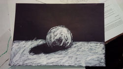
2nd Picture
Final Product:
For my final product I was supposed use my tone skills along with a new tool which carves into lino.To be honest, I really don't think that this assignment went too well. I think that the placement of the shadow and the light on the ball made the artwork seem a bit odd. The shadow makes the light seem that it is coming from the sides but when you see the light on the ball, it seems like the light is coming from above. We were supposed to make the ball seem like it is sat on a table by using perspective and the lino carvers to show the light but it does not seem like I have taken care of the surface as the carve lines seem to be very random and not organised to make it seem like the ball is sat on a table. Overall, I wasn't very happy with this piece but I did have fun creating it as it was fun and satisfying to carve the lino out.
MY FINAL ART PIECE!!!

My Picture
Details:
Our final art piece required our knowledge and skills used in our previous assignments such as Tonal study and lino carving and put them together to make one of the best art pieces we have ever done. The task required us to take a picture of ourselves with something that has a meaning to us and send it to Mr Keys. Mr Keys would then Photoshop the picture into a black and white picture to make it easier for us to recognise which places we wanted light and which places we wanted dark. The now photo shopped picture was the printed and we had to use the print and trace the contents on it onto the sheet of lino. we then used the lino carving tools to carve out the parts that we wanted to be light. After we finished carving out the lino, we rolled ink all over it, put against a piece of paper then rolled under a press. The finished out should look like the second picture on the right.

My final piece of art
Final Product:
When I first saw my finished lino cut (it hasn't been inked yet) I thought that the final product was going to be a disaster. I was very worried but when I finally inked it and rolled it I had quite a surprise because it looked so much better than I thought it would be. i thought it looked good because of the use of tone and the direction of the carve marks. The carve marks give a small but effective way of showing which way the light is coming from and the use of shade and a little bit of light in the left hand side of the piece shows shadow and where the light is not reaching. I really like the detail of have put into the right arm and into my face too as it shows all the folds in the shirt through use of tonal study. I think that the piece may look much better if I had put more detail into to things such as fingers or hands.